


I am been hearing so many things about responsive website checkers which
check whether your website or blog is responsive with popular devices
including tablets, mobile phones, laptops, televisions etc. You can use responsive ads
for your responsive websites. Unfortunately I couldn't find good list
of best responsive website / blog checkers online available to check
shipmethis.com. Here I am listing some of the top responsive website / blog checkers that are online.
1. Responsinator.com – Responsinator show your website in different devices including iPhone 3+4 portrait with a width of 320px, 480px, iphone 5, 568px, Crappy Android portrait with a width of 240px, 320px, Andriod Nexus portrait of 384px, 600px and so on. These show the website only and not the version of mobile hosted on blogger.
2. Mattkersley.com - in this site you can select either devices only or width sizes. You cannot navigate the website shown in the frames. This site shows 240px, 320px, 480px, and 768px frames.
3. Studiopress.com - This website is also like mattkersley.com which checks 240px, 320px, 480px, and 768px frames. This website is made by Matt kersley itself. Now you know the similarity.
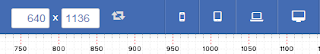
4. Responsive design checker - This site offers sizes such as 27 inch monitor, 17 inch workstation, 15 inch macbook pro, 11 inch macbook air, ipad landscape, nexus, and iphone. These are divided into desktops and laptops and tablets and phones. You can click through each icon and know how your appears in these devices.
5. Responsive test - This site offers scales which we can access the width of our website. You have to press enter to load your website after typing your website. You can change the width of devices by changing the numbers.
6. Responsive.is - This website offers devices such as desktops, tablet landscapes, tablet portrait, smartphone landscapes and smart phone portrait. This is created by TypeCast.
7. Designmodo.com - This is a simple responsive checker where new bloggers can access and study.
8. Dimensionstoolkit - Dimension tool kit is one of the newest response checker in town. This allows websites to view in devices like phone, wide phone, tablet and wide tablet. This also allows users to check the website's responsiveness in different widths up to 2450px. Users can click on the scale to check the responsiveness.
9. Quirktools.com - I think this is a good website for checking your website. This website has scales to check width, many landscapes and portraits, There is option for rotating, allow scrolling button, use of proxy server etc. This one is the best in store today.
10. ami.responsivedesign.is - This is website that show website's responsiveness in laptop, television, tablet and mobile. The advantage of this is that you can see the website version in mobile of rather than the blogger mobile version.
Hope you liked the list. You can suggest other good responsive checkers on the comment section. If you like this post, kindly share it and don’t forget to subscribe us.
Create Alexa Rank Widget for your Website / Blog with JAVA Code
Click here for SEO tools
Click here for more Tips
Click for blogger templates
Click here for blogger tools

responsive
1. Responsinator.com – Responsinator show your website in different devices including iPhone 3+4 portrait with a width of 320px, 480px, iphone 5, 568px, Crappy Android portrait with a width of 240px, 320px, Andriod Nexus portrait of 384px, 600px and so on. These show the website only and not the version of mobile hosted on blogger.
2. Mattkersley.com - in this site you can select either devices only or width sizes. You cannot navigate the website shown in the frames. This site shows 240px, 320px, 480px, and 768px frames.
3. Studiopress.com - This website is also like mattkersley.com which checks 240px, 320px, 480px, and 768px frames. This website is made by Matt kersley itself. Now you know the similarity.
4. Responsive design checker - This site offers sizes such as 27 inch monitor, 17 inch workstation, 15 inch macbook pro, 11 inch macbook air, ipad landscape, nexus, and iphone. These are divided into desktops and laptops and tablets and phones. You can click through each icon and know how your appears in these devices.
5. Responsive test - This site offers scales which we can access the width of our website. You have to press enter to load your website after typing your website. You can change the width of devices by changing the numbers.
6. Responsive.is - This website offers devices such as desktops, tablet landscapes, tablet portrait, smartphone landscapes and smart phone portrait. This is created by TypeCast.
7. Designmodo.com - This is a simple responsive checker where new bloggers can access and study.
8. Dimensionstoolkit - Dimension tool kit is one of the newest response checker in town. This allows websites to view in devices like phone, wide phone, tablet and wide tablet. This also allows users to check the website's responsiveness in different widths up to 2450px. Users can click on the scale to check the responsiveness.
9. Quirktools.com - I think this is a good website for checking your website. This website has scales to check width, many landscapes and portraits, There is option for rotating, allow scrolling button, use of proxy server etc. This one is the best in store today.
10. ami.responsivedesign.is - This is website that show website's responsiveness in laptop, television, tablet and mobile. The advantage of this is that you can see the website version in mobile of rather than the blogger mobile version.
Hope you liked the list. You can suggest other good responsive checkers on the comment section. If you like this post, kindly share it and don’t forget to subscribe us.
Create Alexa Rank Widget for your Website / Blog with JAVA Code
Click here for SEO tools
Click here for more Tips
Click for blogger templates
Click here for blogger tools


Post a Comment